Passages - August Workshop
I finally finished my pages for the August Workshop. We'll be doing the feature layout from the Passages kit. I just love the colors in these papers.... they are from my favorite color families - Browns and Greens. This kit would have been perfect for the trip my family took to Sedona, Arizona several years ago but I already scrapped that trip. The Arizona trip pages were from my early days of scrapbooking - BEFORE I had been introduced to Close To My Heart. But, I'm a firm believer in NOT going back and redoing pages. You lose that sense of 'creative development' over the years if you re-do things. Besides, it is fun to go back and see the early styles of scrapbooking.
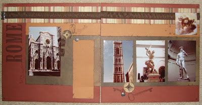
For these pages, I used pictures from my Mom and Dad's trip to Rome back in 1978. Talk about a sense of style! Whoa! I went over to my mom's to get the pictures and she handed me a magnetic album! YIKES! Oh - she knows better than that but I guess having soooo many pictures through the years it is hard to go back and switch every album. She has switched out several already. I had to carefully pull away the photos and re-scan each one. I tried to adjust the color because they were already turning a brownish yellow. Here is the feature Layout from the kit (still need to do some journaling)
For these pages, I used pictures from my Mom and Dad's trip to Rome back in 1978. Talk about a sense of style! Whoa! I went over to my mom's to get the pictures and she handed me a magnetic album! YIKES! Oh - she knows better than that but I guess having soooo many pictures through the years it is hard to go back and switch every album. She has switched out several already. I had to carefully pull away the photos and re-scan each one. I tried to adjust the color because they were already turning a brownish yellow. Here is the feature Layout from the kit (still need to do some journaling)
 |
| Feature Layout from Passages Workshop On The Go Kit |
Next is the Optional Layout shown in the Workshop Brochure. The Layout is Supporting Cast from Jeanette Lynton's How to Book - Imagine. I purchased the matching stickease and used them along with these pages.
The 3rd layout is from Cherish - A New Perspective. Jeanette Lynton's first How To Book that she published. These books are better than the age old Better Homes and Gardens Cookbook! The back of the sheet of stickease helped provide ideas on how/where to use the assorted stickease.
In addition to these THREE layouts, I did make one of each of the cards shown in the brochure and I STILL have this much paper and stickease left! I think I'll save these papers for some 'masculine cards'!
If you like this workshop, check out my August calendar for details. I have an OPEN Club Workshop every 4th Thursday of the month.


Nice layouts Gina
ReplyDeleteLove it all Gina!!!! You are so thorough.. LOOKS GREAT! Thanks for sharing!
ReplyDeleteGreat job Nina!
ReplyDelete