Sassy and Beautiful - Studio J
Today I'm going to share another Studio J layout. This is the 2nd of five FREE layouts that I got to create for attending the Close To My Heart Convention in July. In this layout, we learned how to delete photo wells, used text boxes to cover up portions of the pattern and cropped stickease borders to make ribbon streamers.
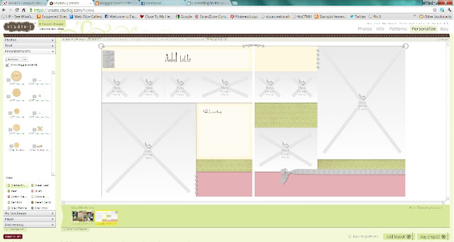
For this layout we chose the Lucy paper and selected the Stars Above pattern. Here is a picture of the layout before I started making changes to it.
One of the first things I did before beginning the layout was 'turn off' the toggle accents. This will delete the accents that are already placed on the layout. See the 'greyed' ribbon and brads on the right page? Turning off the toggle accents makes these disappear and I can place my choice of accents anywhere on the page! (This button is just under the "Embellishments" on the left side)
This layout is designed for 9 pictures. But I only had 3 pictures to use on this layout. I deleted the photo wells that I was not going to use. Next, I inserted a text box in place of that well and sized it to fit the area. I chose my background paper for the text box from one of the paper choices in the Lucy kit.
Here is my finished layout:
See the difference? I changed some of my pattern papers and cardstock to other colors and patterns! This just shows how versatile the Studio J is! The pre-set papers and colors don't match your pictures? Just change them! The pennants are borders that I selected and cropped down to fit my layout. My "sassy and beautiful" title was a one line title. I placed the first "sassy and beautiful" title in the upper portion of the grey area and cropped it down to the 'and'. Then I selected the same stickease title again and this time I cropped off the "Sassy and" and placed 'beautiful' in the lower portion.
For my final touches I added ribbon, stitching and buttons! Stitching is so easy when you don't have to actually get out your sewing machine!!
Stay tuned for more Studio J!


Fun layouts, Gina. I am playing along on the Moxie fab World today and you are #1004 on the blog roll. I enjoyed visiting your blog today!
ReplyDelete